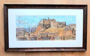
The pen drawing is complete; now comes the painting stage. Interestingly, I’d been posting my drawings of this piece on Instagram as it proceeded and a number of people told me that it should remain as a drawing. I know why they thought that because I love pen and ink drawings myself and have often thought the same. Anyway, experience has shown me that the addition of colour can be really effective.
My objective when producing these pieces is always to retain the visibility of the map itself, or at least parts of the map. Otherwise why would I be painting onto a map in the first place? For this reason, I invariably use watercolours because of their inherent transparency. When I began producing these paintings on maps, I soon found that some of the cheaper watercolours didn’t give me the required coverage, especially where the map was densely printed, so I now always use the slightly more intense professional quality watercolours, Winsor & Newton being my particular favourites.
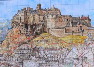
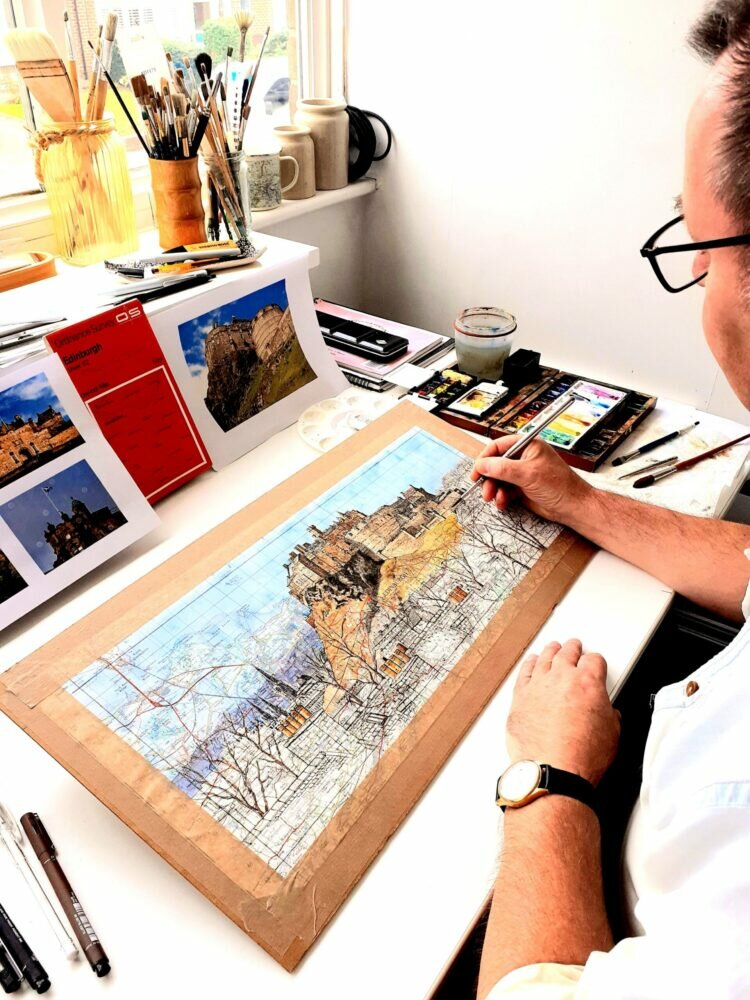
I did mention earlier that the pen drawing is my favourite stage of this process but I have to say that applying the first washes of watercolour paint can be really satisfying – it’s almost as if my drawings are being brought to life. That was certainly true in this case, as my first washes were applied to the sky and the castle itself at the top of the painting and these really lifted the piece to a new level.
Next, I went back into the castle and added some detail and colour variation. A common fault with any painting, especially watercolour, is that they can become overworked and lose their initial vibrancy. When I am trying to conceal parts of the background map which I don’t particularly want to be so prominent, this can be a real problem. There are certain parts of this painting that I would have preferred to have applied a little less paint, but it is quite difficult where there are areas of block printing in the most built up part of the city which I wanted to tone down. Sometimes I have to compromise in order to achieve the effect I desire.
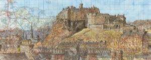
Having more or less completed the castle, I then moved onto the foreground areas with the roofs and chimney stacks, followed by the outer areas of the painting where the buildings were not nearly so detailed and sometimes merely an impression of their true form. Selective painting in less detail and the use of more subdued colours always helps the viewer to focus in on the principal subject, in this case the Castle. Finally I moved onto the middle ground and tackled the intermediate areas, the surrounding buildings and the trees, with just a suggestion of autumn foliage.